SMThemes Support » MiddleEarth
Main Menu Padding Issue

|
11 years ago
Member
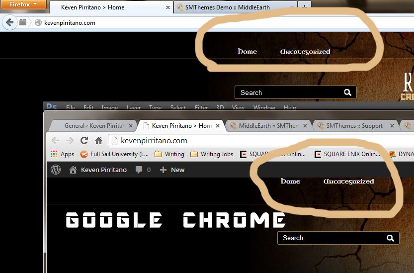
The main menu is centered in Chrome, but isn't in FireFox (it shoves it below the main menu body. My CSS:
Site: kevenpirritano.com |
|
11 years ago
Member
Alright I replaced the CSS with the original, but now in Google Chrome the main menu text it at the very top and in fire fox it is in the location it should be in on the demo.
|
|
11 years ago
Member
Screen shot example.
 |
|
11 years ago
Member
Alright I figured it out.
I downloaded this template from a different website. I uploaded the one from here and it fixed the problem. |
|
11 years ago
Member
Alright never mind that didn't fix it. Same issue as above image.
|
|
11 years ago
Member
Well it seems after awhile it started working. It seems to be an issue in Chrome on windows as it works fine in Chrome on Mac. However, it is working again, but who knows how long.
|
|
11 years ago
Support Service
Hi!
Please, find the code: in the file style.css. You have to add the following style attribute: to this element. |
Leave a reply
Search by forum
SMThemes.com Support
-
Categories
- Framework
- Themes
- Affiliate Company
- Sponsorship Useful pages
- How to start using our themes
- Contacts
 Members Area