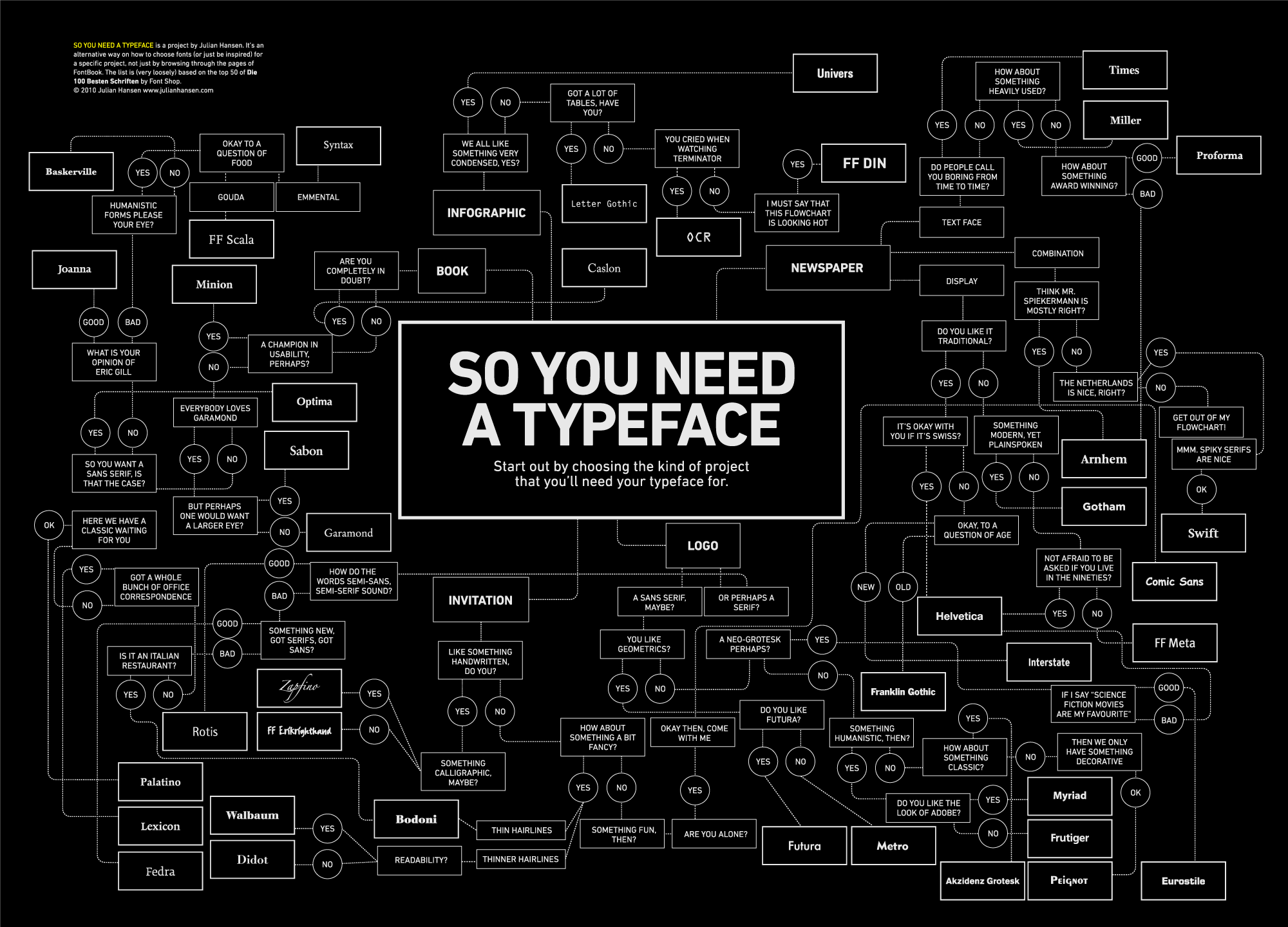
Do you face difficulties in selecting the right font combination? Do you wonder what style goes best for a studymoose review or for a funky text? Read on to find out what factors one should consider in selecting the right font. There are plenty of them available for a person can choose from, and investing time to pick the right one will be a great choice. You should pick a style that helps you in leaving an impact and delivering the intended message to the readers. So, what are the points to consider before selecting the right font? Read further to find out.
Factors to consider while selecting the perfect font
#1 Legibility
The font that you select for your text should be readable and legible, and it should be strong enough to attract the reader's and hold their attention. You can choose decorative as well as eye-catching styles for the headlines and titles. This will help you in attracting readers making them curious about that particular text.
#2: Demographics
It is essential to know your audience. That is, know well their age range and interests as your main aim is to engage and attract the audience. That is, it doesn’t matter what kind of business or design we are talking about, making it catchy is a must. For example, if your research is made for a tech-based audience, you would want it to look digital, neat, clean, and modern for them to find it effective. On the other hand, the kids would want something big and vibrant.
#3: The debate of Sans vs. Serif
Serif typefaces are found to be easily readable when it comes to a lengthy text. However, this rule does not apply at all times. There are certain other factors, too, which need to be considered. The most significant ones include what medium is being used, that is print or web (digital) as well as the typeface.
#4: Font family size
It is essential to determine the typographic requirements well in advance. There are specific designs for which, two weights paired with italics might be sufficient while other require additional weights. It is necessary to understand this in advance to ensure a better visual hierarchy that is needed for effective designs.
#5: Special features
Special features add the ‘extra' factor that makes some designs look more beautiful. For example, the use of alternate characters, small caps, foreign language support, etc. add more value. In today's times, there are several OpenType fonts that contain these special features implicitly itself. It is important for you to look into these while conducting your research.
#6: The media used
It makes a difference as to which media is going to be used for the display of the design. If the typeface is required for print, then, it must be simpler and more legible. On the other hand, for the web as well as other digitized media, it must be appropriate for different environments.
How to pick the best-fit font combination?
It is considered best to choose two different typefaces, one for the body and one for the headlines. The combination of the two must be ideal for conveying your message. Here are a few tips to help you choose the perfect pair:
Make a combination of serifs with sans serifs
In a pair, it is always a great idea to pick fonts that complement each other. Therefore, a perfect obvious pairing would be of serifs and sans serifs. You could make use of sans serif type for the headlines. And, for the body, a simple serif font could be chosen.
Select the font families that have both serif and sans serif typeface
If you wish to get it done quickly, be wise, and pick the fonts that come under the category of ‘super-families.' These have both serif and sans serif typefaces, multiple weight varieties, several different styles, widths, etc. A few super-family ones to ease it out for you are: Typographic Picnic, Thesis, Goral, Spirited, Storyteller.
Avoid similar fonts
Fonts that are similar will make it difficult for the readers to focus on the ideas and the overall structure of the text. If you select fonts that vary significantly in style but have a similar stroke weight, you will be able to leave an impact on the readers.
Focus on contrast instead of conflict
Select a style that is contrasting as this will help in leaving a clear impact on the reader. The audience will easily be able to go through the page with the guidance that the font provides. This will also make the readers focus on the most important parts of the entire body of the text. A good combination of a contrasting font is combining sans serifs fonts with serifs.
Which font to pick for what business?
This question can be confusing to answer if you are not well-acquainted with the different fonts and their appeals. While the serif type symbolizes history, tradition, safety, etc., sans serif are more contemporary, modern, and clean fonts, there are script ones that portray a little romance, elegance, sophistication, and feminism.
Here are a few examples specified as per the business type:
- A design agency: Suitable fonts would be Helvetica Bold, Gotham Black, and Montserrat Bold;
- Wedding and other creative field related business: Anisha Script, Beautify, Roses, Please!, etc.;
- Finance: Bembo, Andrew Samuels, Clarendon, Gotham Narrow, etc.;
- IT or other tech firms: Moon, Simplifica, BW Quinta, Pier, etc. ;
- Fashion: Geosans Light, Gotham Thin, Helvetica Neue Thin;
Selecting the right style is crucial. The font that you choose should be modern, readable, have contrast and should deliver the message. You should also think of your audience before selecting the style. If you are writing for a children's book, choose a font that is more playful. On the other hand, if your readers are adults, you should pick a style that represents trustworthiness and stability. It should attract them = and leave a powerful impact.
 Members Area


