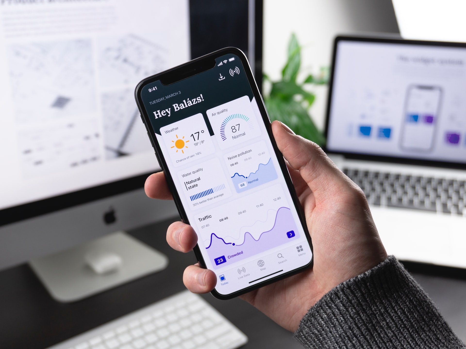
Nowadays, it's difficult to find a technology or software firm that hasn't at least once modified the UI and UX of their app. For instance, you may recall Instagram's previous skeuomorphic design before it made the switch to a flatter and more straightforward one.
You must know when to make plans for a redesign despite the fact that change is inevitable. Depending on your needs, an app redesign may or may not need a significant investment in time and money. But it undoubtedly has an impact on your future earnings (and company). Redesigns should never be carried out impulsively, and you are encouraged to speak with a reputable UX UI design agency before moving forward with the adjustments.
Let's now look at some of the warning indicators that will help you choose the appropriate path.
App downloads that are trending downward
Monitoring the amount of downloads is one of the finest ways to determine the viability of your software. The number of app downloads is another indicator of user engagement. Therefore, if your program is downloading in the hundreds of thousands each day, this indicates that users like the way it is designed.
On the other hand, you need to evaluate the app's design if you're not obtaining as many app downloads as you'd intended. Pay attention to the app's name and icon, its description, and its overall look. Perhaps the font choice is unappealing, the color palette isn't appealing enough, or the drawings aren't strong enough.
A high churn rate
Users that abandoned or stopped using your app after installing it are referred to as having a high churn rate. Keep a tight eye on the churn rate because studies show that 79% of users abandon an app during the first day, and that percentage may quadruple after three months.
Here, keeping current users is more important than gaining new ones. You should therefore give your app's design and user interface a close examination if your churn rate (or user retention rate) is high. Among the frequent causes of a high churn rate are:
- Complicated or confusing UI
- The app's navigation is a maze
- The app crashes far too frequently
- The app takes a while to load
There are not a lot of everyday active users
Do people utilize your app every day? No? If user engagement is low, it may be because consumers dislike the app's appearance, think its features are outmoded or feel that there are too many steps involved in doing an action. To make the procedure easier for your consumers and make the app more user-friendly, you should think about redesigning it at a professional blockchain design agency. Additionally, you should think about regularly releasing bug fixes or new feature updates to keep consumers interested and motivated to use your app.
Low screen views per visit and average visit duration
The average number of visits and screen views each session for each user are referred to as the average session length. Keep track of how many app screens each user interacts with in a given session. These two metrics can help you determine how involved your application's active users are.
In general, your consumers should utilize your app extensively and interact with a variety of screens. This demonstrates a high degree of participation. If this isn't accomplished, you must determine why users are quitting your app as soon as they open it and why engagement rates are low. Find the screen in your app that receives the most drop-offs and investigate the causes. When redesigning your app, you can make the necessary modifications using surveys or user feedback.
The app's overall rating is under 3 stars
A poor app rating of less than 3 on the App Store or Google Play Store is one of the major caution signs. A fast approach to learn what your users think of your app is to look at its rating. Additionally, the app's rating will influence whether or not additional people download it.
Therefore, if your app gets a low rating, it is essential that you thoroughly audit it to determine what is wrong. Prepare yourself to spend money on a thorough redesign of your app as well.
A number of issue areas were listed in the screen flow assessment report
Screen flow assessment keeps tabs on user visits to screens overall, the flow across different app screens, and exit by the screen. It also aids in tracking user behavior or interactions with your program. This evaluation is carried out to determine how people move throughout your application. A lot of issues in the assessment report indicate that your app needs to be improved. To re-engage users who have lost interest in your app, you must think of methods to make the app's navigation simpler, develop better funnels, and even develop in-app marketing campaigns.
So, have you seen these clear signs? Do you believe that the app needs to be redesigned? Get an expert opinion by contacting a UI/UX design team today.
 Members Area


