 Members Area

Many of us have heard this word combination "Responsive Design", but those who are not professionals in web development may not be aware of key features of this design. How does it work and why? Is it really a benefit of your website? All these and that question we will discuss in this article by the examples of Smart Magazine Themes.
What Is Responsive Design?
According to Wikipedia article we may know that "RWD is an approach to web design aimed at allowing desktop webpages to be viewed in response to the size of the screen...".
Thus if a web developer promises that his work - your future website will be responsive then it means that ANY visitor who opens your website with the use of ANY kind of device or gadget in ANY browser will see a nice looking website. It must look like it is supposed to be.
The main rule is no surprises.
Benefits Of Responsive Design Over Fluid Layout
A developer must think of website adaptation to different screen sizes when building an HTML structure of your website long before writing styles for it.

An ideal way to make website responsive is to create a structure according to which main elements will have proportional width in some cases and center position. This website of VAN rental Round Rock can be a good example of the website with the responsive web design. For example, main container of website may have width set into 1000px.
#container {

width:1000px;

max-width:100%;

margin:0 auto;

}
Of course, #container width may differ, but "max-width" css property must be there if width is set in "px", not in percentage.
Fluid Design is based on percentage values. In this case all the elements and containers will be adapted proportionally the document size. Fluid layout may look like:
#container {

width:100%;

}
This code will fit any screen, but it doesn't mean that it will be nice looking as well.
Full width text container is extremely enoying if you have to read the infomation from left to right along 1920px or even more (!). You will have to move your head to read. The best way is to find a gold middle between fixed and fluid values as SMThemes developers do.
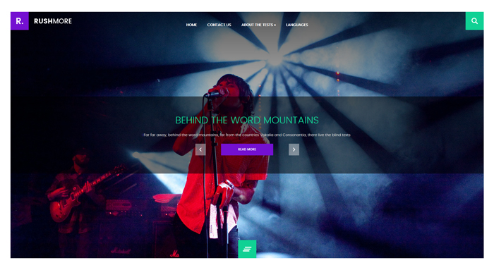
Header section doesn't have lot of text infomation and that's why some designs take full width: Vendor, TwoGamer or RushMore.
But content part would better be fixed and center aligned.
Thus our free WordPress themes come with Resonsive Web Design which guarantee a proper website appearance on any device and screen size.
How Does RWD Work?
Usually a developer works with a particular screen width device and doesn't test his work in every step. Using knowledge about adaptive design technique he just works hard to make the website appearance fit your desire.
But what is this "technique" about?
First of all it is about width of tones elements on your web pages. Thus images must be fully visible on any screen width from iphone 5 without retina desplay till high resolution screen of a personal computer.
Three following things have to be taken into account:
- Fixed width must be completed with "max-width" property,
- @media queries must be used for small screens,
- Elements that looks nice next to each other on a wide screen are better place vertically on a smaller devices than decrease their width proportionally to a screen size
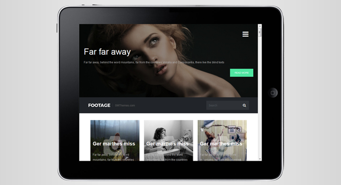
And all these things are considered in SMThemes. Have a look on demo of the Footage theme for instanse:
I hope, that thanks to this article you learn how to test responsiveness of any website and detect whether it is enough adaptive or not.
We would like to mention that there are a lot of things you have to keep in mind when developing a website. For instance, blog is a must-have for almost any website. And here you can find the steps for essay writing which will definitely bring you to a success.


