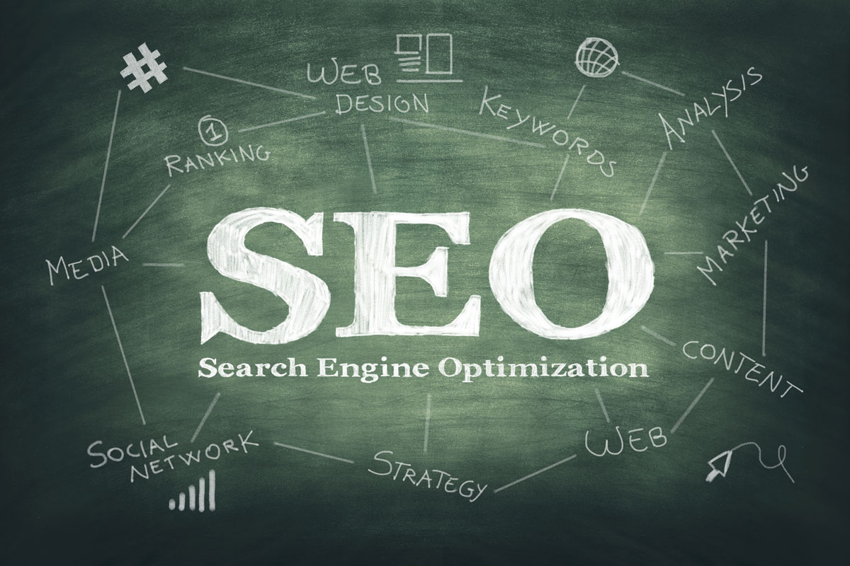
Boy, is that a new spin on the dusty idea that web design is just about a bunch of pretty colors and cool-looking graphics and pictures.
Where law firms are concerned, as well as in many other fields, web design is a huge player when it comes to Google ratings, search algorithms and user experience. Gone are the days when web design was all about art and back-end coding.
Great website design should not only be visually appealing, but it should also be steeped in SEO research. A data-driven approach to design can boost your conversion rate and increase your bottom line. There’s a whole science to design, and well-trained practitioners know how to leverage it to maximize your SEO.
IF YOUR CURRENT DESIGN ISN’T INCREASING LEADS THAT GENERATE CASH FLOW, THEN IT’S NOT DOING ITS JOB.
The look and feel of your website directly impacts how you are perceived by potential clients and your competitors. The effectiveness of your design at engaging with prospective clients influences the conversion rate of your site and, consequently, the profitability of your practice.
Design is the scientific brain behind effective SEO. Think of it this way … when hiring a designer for your website, you want an Einstein, Tesla or a Spielberg. You don’t want someone with just a colorful box of Crayolas.
So, the next time you’re tempted to hire a low-cost “design firm” or your neighbor’s teenage son to build your firm’s web site, ask these folks to analyze and discuss load speed, mobile-friendly compatibility, hidden content indexing, E.A.T design and content formatting.
Site Formatting Affects SEO
When it comes to
Google ranking factors, recent algorithm updates confirm that the
quantity and quality of on-page content remains one of the strongest
factors. It is imperative that your webpage(s) have substantive and
significant content that is related to each page’s specific topic.
Here, we’re defining “content” as design as well as the written word.When determining rankings, Google considers …
- How long a visitor stays on your page
- How far they scroll
- How they interact with a page of content
If your website design is structured to simply drop 2,000 words into a large wall of un-styled content, you’re in trouble. This approach will harm your SEO because its user experience will be poor.
Google
rewards websites with positive user experience (UX), which includes
sites that load quickly and are easy to navigate. After all, who wants
to sit and wait for a site to load with one image at a time coming into
view and gaps of missing text? That’s so frustrating! Google has
integrated site speed as a SEO ranking factor.
Site speed is influenced by the speed of the server your site is hosted on, the connection speed of your visitor and the programming code behind your website’s design. Design-specific elements that have a direct impact on load speed, include:
- Number of Images – Is your website’s design really image heavy? If you have 15+ photo and image files on your homepage, then you better believe it’s probably slow to load. It’s not just the number of images that matters. The size of images does, too.
- Image Size – What are the width/height of images on your site? Are they too big and cropped improperly? The larger the file size of those images, the slower your site loads and the longer a prospective client has to wait.
- Image Compression – Did you know there are several design tools that can compress and optimize images (without diminishing quality) to ensure the smallest possible file size? Yep, there are! One example includes tinypng.com. For firms running WordPress websites, we also recommend the Smushit! and EWWW Optimizer plugins.
Keep These in Mind, Too
Readers are in a hurry and
they don’t always read every word from top to bottom. They also enjoy
“visual breaks” like videos, photos and graphic elements that
effectively convey information but give the eyes a break from so much
black and white text. Keep in mind the following:- Scan-ability – Most visitors will scan your webpage first, even if they scroll back up the page to dig into the content that interests them most. That’s why your design needs strong headers, clear section breaks, sub-headings and other design techniques that make the content easy to scan.
- Multi-Media Integration – Inserting infographics, videos, slide show presentations and other topic-related visual assets will break up the content into manageable bites and provide engagement opportunities to your visitors. This encourages visitors to stay longer, interact and boost the usability of your site – enhancing your SEO.
- Content Formatting – Design should provide for a wide range of content styling including bulleted lists, quotes, on-page links and other visual cues to improve the readability of your content.
- Hidden Content Indexing – A big change in the last year includes Google’s decision to start indexing “hidden content” on your website when determining its rankings. Content that is “hidden” includes information that can be opened/closed or expanded/collapsed with tabs, accordions, roll-overs or other design elements. Designers use these tools to prevent a webpage from being cluttered and overwhelming or looking too text heavy. For a long time Google did not include hidden content when ranking the quality of a page, but beginning in 2018 that changed. So, all content – visible or otherwise – needs to be top-notch.
 Members Area
