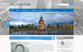
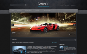
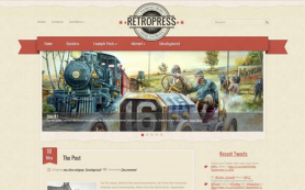
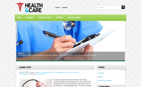
Do you know how different the websites are? Basically, they look different, but the structure is rather similar. We have summarized the most frequently used of them here to help you imagine your future website and choose some of them for your needs!
Logotype
Logotype is an emblem or graphic composition that must be directly associated with your company. It is extremely important to create a good logo for your business, because people should recognize you and your services by this design.
That’s why logo have to be placed at the top of your web page. It is usually linked to the home page. So everybody can return back to the main information of your website just .
Menu
Perhaps you've seen it many times on each website. There is no web page without menu or navigation. It contains all the main sections of your website. And your visitors mustn’t search for the information on your website - it have to be on the surface.
There are many ways to display the menu on the page. There are
- vertical and horizontal menus,
- main and secondary,
- multi-level menus,
but what is better? It depends only on your taste. The latest trends are "hamburger menu" and "fixed menu".
Is It Reasonably to Use Haburger Menus For Desktop View?

It is aimed to save place on the screen and can be opened only when you pay attention to it. Some of them can be opened by hovering an icon of the menu or by even click. This trend came from the mobile versions of the website where this type of menu is required. But that came to the desktop versions as well. Perhaps, it is better not to hide the menu and save your time instead of clicking some more elements to get the helpful info.
What Is Fixed Menu?
Fixed menu is a really good way to keep your visitors on your site longer. Menu is always next to you - at the top of the page as you can guess by its name ;) Look at the example on the Mastor WordPress theme. Scroll down on demo and feel how it works.
But there is one gold rule: the less time visitors waste on clicking the more grateful they are to you. So they come back again to your blog or personal website the next time since they can easily and fast find the needed info.
Slider
If you are going to create a photography blog, portfolio website or real estate agency online catalogue this element will be highly rated by your readers. What is the best way to present your works? Probably, full width slider like the Cabana theme or Phonow have for instanse.
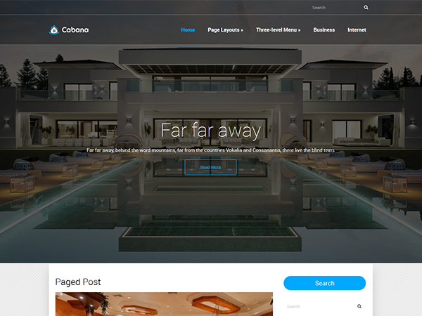
According to the settings of our themes you can hide this element from inner pages or even from the home page. Why? Because in most cases this huge element is not so necessary for simple blogs or inner pages of the coorporate website, really! It is much better to optimize place on inner page and place the content part of your website right under the menu. And since we're building a photography blog, portfolio website or real estate agency, you'll need a WordPress appointment booking plugin to organize your calendar better.
Sidebar
This area is some secondary information that readers are not asked for, but that may refer to the content of your website and be also interesting for them. So to keep visitors on your web pages you may use this optional WordPress section that can be extremely useful when you know your goals.
Content Part
This section is so versatile that I can't classify it or give a concrete definition for it. But we all know that this is the main part of any website that is located between header and footer. There are lots of elements that we could cover here but we'll only mention tables since a lot of people have problems with making them responsive. If you are not a coder, an easy way to add a responsive table would be by using a WordPress tables plugin that would handle the responsiveness natively.
Footer
If your website is really interesting the reader will scroll down and down till the end of the article and at least he or she will see the footer. Thanks to it reader won't need to scroll up and search some page again. Place some navigation there again, basic information about your company, perhaps, some contact information - if the visitor is satisfied with the content he probably want to call you right away - don't miss the opportunity to get a client!
Besides, footer is the right way to place the copyright, terms of services or licenses and contact details including your business email address and phone number. But it is all up to you and this section is optional. You may just add a scroll-up arrow at the bottom of your website and that's it!
All these elements and even some more are presented in our themes. Explore the collection and choose the best for your website!
 Members Area