 Members Area

It is a fact that the world of today has moved from desktop to mobile, so it goes without saying that you need to focus your efforts on a quality user experience. Even though the user interface is essential for a mobile-friendly design, the UX has become as important, with all the new mobile devices and the fact that it’s different for every one of them.
A good UX goes beyond aesthetics, it has to provide your website visitors the best and quickest way to get what they are looking for. Here are some of the essential practices to optimize your site to be mobile-friendly.
Fluid layouts
When designing for mobile, you will be faced with the fact that there is just too many screen sizes out there to choose from, so you definitely need a more practical solution. What you need is a layout that can seamlessly adapt to any screen size. The solution to this is to use fluid layouts.
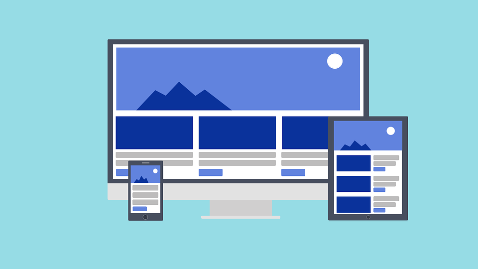
As opposed to fixed-width layouts which are measured in pixels, fluid layouts are based on percentages, which enables them to be a lot more flexible. By setting a percentage, you no longer have to think about what is the size of the device, because your design will adapt to any size. Fluid layouts are a standard for web professionals, and are worth checking out.
Design for touch screens
You need to keep in mind that people who are visiting your website via a mobile device are using their fingers instead of mouse pointers that offer them great precision. Therefore, it is necessary that you design your website so that it isn’t hard to navigate depending on different finger sizes and shapes.
If your user is forced to pinch a lot, or zoom in in order to tap on a button or fill out a form, they will easily become irritated and decide that your website isn’t worth the trouble. Tapping on wrong things is common for small devices, so you should make sure that your design offers touch inputs that are large enough.
Go mobile-first
If your website aims at the perfect mobile user experience, then you might want to go for the mobile-first strategy. There’s nothing wrong with focusing on this method if you are certain that the majority of your users will visit your website via their mobile devices.
Mobile web design is more than a niche, it focuses on more than a billion mobile users all over the world. While it may prove to be a challenge, if you are aiming at putting your user first, it might be the tactic that you’re looking for.
Dynamic serving
If you’re lacking the necessary resources to completely redesign your website, or you are simply looking for a way to display alternate content for your mobile visitors, what you can do is use one URL to show different sets of CSS and HMTL appropriate to the device that you visitor is using.
This is also called detecting user agents.
It’s a useful solution if you are, for example, a shop that wants your mobile visitors to get a hold of a sample of reviews of your services and a map how to get to you instead of a complete website.
In order to display different content to various user agents, or in other words, implement dynamic serving, you can do this by using the Vary HTTP header.
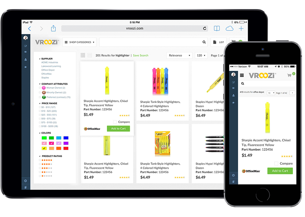
Separate mobile URL
You can also create another website particularly for your mobile users. This enables you to create content that is completely customized for their wants and needs. In order to not get the URL-s mixed up, the majority of parallel mobile websites use an “m” subdomain. Have in mind that it is possible that your parallel mobile site might suffer from the problem of sending the users to the wrong version, so you need to make it easy for those who get to the wrong place to tap back and reach their preferred option. Furthermore, you’ll want your site redirects to be in place, and work to the benefit of your page’s speed.
Implement compression tools
There is a wide variety of tools out there that can make a designer’s job much easier.
- If you need unnecessary code, comments or white space removed, you can use a script compressor tool such as HTML compressor.
- In order to concatenate CSS code and boost your performance, you could try out CSS minifier.
- It is also essential for you to implement image compression, by using tools that will decrease the size of your .jpeg and .png images without affecting their quality. Some of them include EWWW Image Optimizer and jpegtran.
Identify your users
It is a bad strategy to try to cover every base possible, because it may affect the experience of a typical user, which is what you should avoid. You need to find out who your users are, and then identify their typical behavior when they are browsing the web. Once you have determined this, you need to find out what kind of UX are they looking for. Some of the today’s users are browsing without a particular goal, while others are aiming at a certain task they want to perform. Both of these groups need different functionality that is appropriate to their needs.
In summation
With the fact that there is more than a billion mobile users out there, you need to focus on optimizing your website for their needs. If you take these tips into account, you will be on your way to ensure a great user experience for your mobile website visitors.
Author bio: Sam Cyrus is CEO and co-founder of https://agseosydney.com.au, a Digital Marketing agency from Australia. Sam is also a creative writer and likes to share his insights on entrepreneurship, business, online marketing, SEO and social media. He currently collaborates with Nirmal Web Development Sydney.
 Ronnie Blake
8 years ago
Ronnie Blake
8 years ago


