 Members Area
Adjusting the design, layout, and copy of your website to your target audience is one of the staples of online success. Ideally, you want to do your research carefully and test out different variations. Once you’ve settled on a version that works best, you’re ready to launch and promote it.
If your product or service is specifically targeting a senior demographic, you want to consider designing it in a way that will appeal to them more than other websites do. Here are nine ways you can do that.
Create More than One Landing Page
If seniors are not your only target demographic, you can design separate landing pages for different audiences. You might need to take some time to analyze the ways in which seniors reach your website, as opposed to your younger demographic, and ensure they are seeing a landing page designed specifically for them.
You can also set up a banner or button on your homepage that will let seniors know there is a section designed specifically for them, if they would care to click and check it out. In that case, make sure this element is easy to spot and understand.
Increase Your Font Size
The simplest thing you can do is make your copy larger. This will help those who have a bit of an issue with their sight read your words without having to zoom in, fetch another pair of glasses, or ask a family member to help them read what you’ve got to say.
Format Your Text Clearly
You also want to break large chunks of text up into smaller, more manageable sections. This is true of any copy on any website, but when it comes to seniors, try to go a step further and keep your paragraphs extra-easy to digest.Whenever you’re moving from topic to topic, introducing new information, or emphasizing a point, use a separate paragraph or a stand-out sentence. You should also make good use of bold and capitalized words if you specifically want to make them stand out.
Use Numbers and Bullets
Numbering steps can be a great way to help someone grasp information easier. For example, if you’re writing out a recipe or a guide to assembling a piece of furniture, numbering the steps will ensure that your users don’t get lost and that they can easily pick up where they left off.
This kind of user experience is what will ensure your users keep coming back. As we know, UX plays a major part in rankings and sales, so any little bit helps, no matter how trivial it may seem to you.
Speak a Plain and Easy-to-Understand Language
While you may be able to take your copy up several notches and explain your point in a more scientific, advanced, or intellectual way, you want to stick to simple and easy-to-understand words and concepts. That’s especially if you’re describing a piece of tech or a product that seniors have not grown up with and might not be accustomed to using.
Change Your Links
According to The Nielsen and Norman Group, seniors are twice as likely to give up before completing a digital task as younger users. You want to help them out by mapping out their way through your website.
Start by making your links very obvious – while a younger user might understand something is a link quite easily, seniors might not know they can click on something. You can use the actual words, “click here to do X,” and use specific CTAs for seniors.
You also want to distinguish links that have been clicked on from links that have not been clicked on. This will save your senior users time, and they won’t have to keep browsing your website, looking at the same pages over and over again.
Keep Things Uniform
You will want to keep your pages similar across the entire website so as to avoid confusion. A senior might not be able to understand that they are still on the same website if they keep seeing all kinds of different pages.Uniformity will ensure they feel safe about their location and know what they are looking at, and they will have an easier time navigating your website.
Make Error Messages Clear
This is especially true for contact and purchase forms. When someone enters data into a contact form or tries to make an order and does not fill out the form correctly, you want the error message that pops up to clearly state what the issue is. Perhaps they have not entered a valid email address? If this is the case, make sure the message reads “invalid email address,” as opposed to “an error has occurred.”
Highlight Your Main Message at the Top
Try to position your main message at the very top of your page. This will save seniors the time and effort they would need to go over the page, read it, and understand what it’s about and what they can expect to get.You can use an image to help you deliver the right message, as opposed to just text (just like you would with any other hero section).
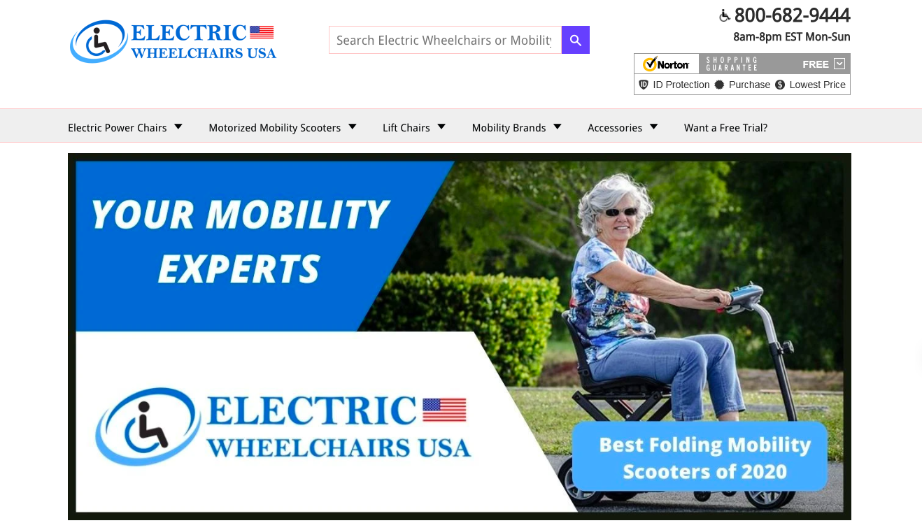
And Now for an Example
As some of what we’ve been talking about is a bit abstract until you see it in action, take a look at Electric Wheelchairs USA as a great example of a website that targets seniors. This website is designed with seniors in mind, and the designers have done their job well. The site ticks all the boxes for senior-friendly UX:- There’s a prominent hero image.
- There are smaller and larger fonts on the page.
- The words that need to specifically stand out are bolded.
- The website is easy to navigate.
- It looks the same across all pages.
Final Thoughts
Making a bit of an effort to ensure your target audience gets the smoothest possible experience on your website can improve your conversion rates manifold. By taking the time to understand your audience and their specific needs, you’ll be able to design a website they will love to visit, will not find confusing, and that they will trust to make a purchase from.
 Psychology Coursework Writing Services
4 years ago
Psychology Coursework Writing Services
4 years ago


