 Members Area

Too much noise about responsive web designs are there. What do these words mean? How to optimize your website for those mobile devices that are launched every day? All this questions will be answered in this article once and for all.
What is Responsive Web Design?
The responsive web design ( or RWD ) is an approach to make your web page look good despite the screen size of your device. Using different technics based on CSS and HTML the layout should respond to the needs of the web page readers and the devices they are using. This is a simple rule that have to be obeyed.
How to optimize your web site to adapt it to any screen size?
Now choose who you are - a novice developer or just a newbie in the web. There is some principle difference in the answer that depends entirely on your experience in this field. The best agencies start with SEO right from the very beginning of the design and development stage. On-Page and Technical SEO optimizations can be done well during the development process itself. This ensures that you do not have to go back once again to complete the optimizations. If you are looking for the best web design and development agencies, view website.
You are a beginner and have never coded before
You would better choose the theme that is already packed with this option. In this case, you only need to check the page on responsiveness when this theme is activated in the dashboard of your website. There are plenty of ways to do this starting from the resizing the browser to using the online responsive design simulators. The gold middle is to use the built-in developers tools of browsers.
You are a novice developer
If you develop a responsive site there are several basic rules to follow:
1) to create a really flexible website do not use a fixed width, margin, padding
You may easily give these properties percentage values. Use “width:100%;” or "max-width:100%;" instead. This helps you prevent the appearance of an unpleasant scrollbar because the element is bigger than width of the screen. To make things clearer inspect the featured image for this article:
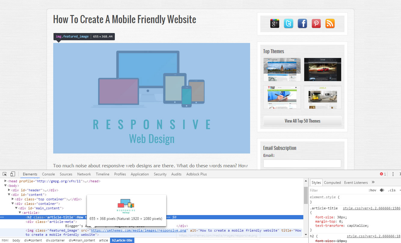
Have a look at the featured image for this article. Its original width is over 1900px, but it is perfectly fit the size of the parent container thanks to the "max-width" css property.
2) use @media queries to specify some other styles for a specific screen size, look at the example below:
@media screen and (max-width:1024px) {
	#slider {
		display:none;
	}
}
This code will hide slider from all the devices that are less than 1024px width.
3) and the main thing is to determine the breakpoints for these @media queriesYou have to imagine how your website should look on mobiles or tablets. This is the right way to success. You may even include the needed css files in dependence of the screen width like it is shown below:
<link rel="stylesheet" href="<?php echo get_template_directory_uri()?>/css/mobile.css" type="text/css" media="screen and (min-width:240px) and (max-width:639px)" />
<link rel="stylesheet" href="<?php echo get_template_directory_uri()?>/css/tablet.css" type="text/css" media="screen and (min-width:640px) and (max-width:1023px)" />
Now responsiveness is an integral part of the web design. Even search engines proclaimed that websites that have a mobile version will get a ranking boost. Who knows? The only thing we know for sure that the responsive design is not only mobile friendly, but user friendly as well. And we hope that this article will help you to achieve both goals.
 valuablesbrain
5 years ago
valuablesbrain
5 years ago


