 Members Area
Most clients still don’t understand the difference between a web designer and developer, or even know it exists.
WordPress front-end developers exist somewhere in the middle of the scale with code-wrangling developers one end and artistic designers on the other. I have first-hand experience trying to skirt those edges, and for those of us who favor hours spent coding over minutiae of design, there are certain problems. Most common of those is: Who will care for your lovingly crafted interface if it doesn’t look good?
This is why we have a design handbook for WordPress coders to dig into, just to make sure that their front-end code creates an interface which is as aesthetically pleasing as it is powerfully efficient.
Here are the basics:
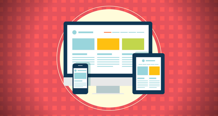
1. Consistently Responsive
Let’s be clear: there’s no room for static, fixed-width pages on the web that’s evolving around us at an accelerated pace.
If you aren’t aware, responsive design is the principle of making web design adaptable to any screen dimension, so that the same page can be usable on various devices without forcing a user to scroll up, down, and sideways just to read one complete sentence. There are no two ways about this: Mobile traffic took over desktop 2 years ago and is steadily rising. Not adapting loses you a significant part of the audience and takes away points from your SERP ranking.
Instead of resorting to jumbled up mess of media queries and CSS hacks cobbled together from various sources on the web, think of Responsive design principle as progressive enhancement from the smallest screen (typically a smartphone) to the largest one used by the client’s target audience.
Make sure you’re doing this right. There are great frameworks like Bootstrap and Foundation, and amazing grid systems that can help with responsive design. Once you have the breakdown on the process, you’ll be able to experiment and reform your technique.
It’s easier than it looks. If you want to stay in the running, you have to go responsive.
2. Accessibility
Have you watched Daredevil? Would you treat Matt Murdock (esquire) differently because he is blind? I hope not. Even though he’s a fictional character.
Essentially: Make sure your work does NOT solidify your reputation as an ableist.
According to the pioneer of accessibility ready internet (WebAIM), the most common enemy against accessibility isn’t lack of empathy for the impaired. It’s simply that implementing accessibility criterion within front-end code is more trouble than developers are used to dealing with. There’s also the client and the management poking in, but that’s a whole different brand of subjects I would rather not go into right now.
WebAIM’s accessibility 2.0 guidelines specifically take note of these problems and help developers overcome them. WordPress standards aren’t as strict, but your efforts will not go unappreciated. Accessibility-ready themes are trending.
What you can do is research the uses of WP Accessibility plugin, check out WebAIM’s guidelines, and practice implementation of switchable stylesheets, magnifiers, transcriptions, keyboard controls, et al for your audience with physical impairments.
Remember that this isn’t only about goodwill. Accessibility is required by law for certain website verticals in many states. It’s also good to note (especially to management/client) that accessibility-ready designs earn bonus points on SEO.
3. Whitespace
This is one underrated design element, especially given its significance.
Have you read a medical research paper? Or a fiscal report? If you answered no, I envy you (God, I really do), but that’s not what I mean.
My point is that large, unbroken wall of text are intimidating even to people who are reading it on purpose. It’s monotonous and tiring for the eyes. This is why formatting is focused upon. This is why good coders indent and colour code their work. It’s the same principle.
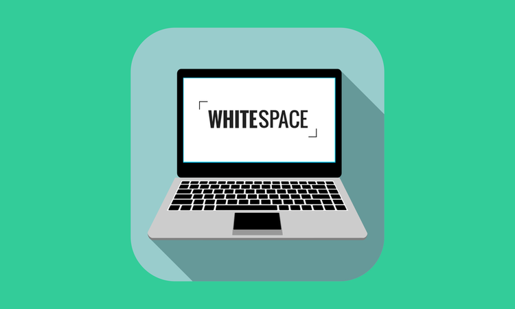
Whitespace, or nothingness in a design makes everything exponentially clearer. Minimalistic designs go for it all the time, but that’s not the only use for it.
Whitespace separates and breaks. It is the glue that holds your interface elements together. It gives audience time and space to breathe.
Learn to use whitespace effectively and control the chaos of design. Websites like iA.net, Molamil, Bluestag have it figured down to a science.
4. Typography
This is another design element which is sadly underrated, especially on the multimedia-centric web.
You want audience to focus on your (or clients’) message, and you have to come to terms that a significant part of it will be written down in text. The font you use to display that text will decide several important points like its readability, how seriously the audience takes the message, and your own brand’s identity.
Between WordPress and Google Font API, you have endless numbers of fonts available at your fingertips. A careful evaluation of your website’s intended purpose and message, along with the rest of the design will clue you in to the fonts that feel like they belong.
Yes, a lot of it is gut instinct. Practice and you’ll hone it no time (as long as you don’t create a pattern with 2 fonts that you stick on everything).
5. Forms
This is a highly debated area, and everyone has opinions based on AJAX and radio buttons and this and that. It can be difficult to sift through the noise.
For a developer, the only thing of note is that forms should be usable on every device. They should have a tone that’s friendly and within context. Seriously, look at Virgin America’s flight booking form and tell me it’s not a thing of beauty.
The length of the form is inconsequential. It depends on the context: If it’s a submission form to a directory, it’s okay to be thorough with more than a few form fields, but users won’t feel the same about a subscription/mailing list form. WordPress has Contact Form 7, but these principles should help you decide how to implement it.
6. Customized “404 Error” pages
Whether it’s your fault the page is missing or the users’, a special page that tells them there was a mistake, apologizes for it (optional), and gives them the option to redirect themselves (do NOT auto redirect: that’s only confusing for a lot of visitors and they WILL spend time trying to understand what happened) to another page will go miles into tampering the annoyance factor down and keep the users engaged.
7. Keeping Pace with Latest Trends
WordPress has ‘officially’ declared JavaScript the programming language of the platform (figuratively). Web design is favouring scroll-based storytelling and immersive experiences over pages upon pages of text no one wants to read. Microinteractions are making interfaces lifelike and intuitive. Widgetized homepages are en vogue with WordPress. Are you keeping up?
Stay on top of the latest design trends: especially in the fields of UX and UI. These help you keep pace with the new developments and easier ways to implement them in your code.
Endnote
Developers often close up to the very people they are coding interfaces for. The one trick that I particularly find useful is to stay empathetic with users. Ultimately, they get to decide what works and what doesn’t. Invite feedback from the audience and embrace the changes.
Author Bio: Lucy Barret is a web enthusiast who loves everything to do with web development and her passion revolves around developing WordPress websites. Her primary focus is on WordPress, as she creates themes, plugins and provide solutions with her team of expert WordPress developers at HireWPGeeks.
 Ronnie Blake
8 years ago
Ronnie Blake
8 years ago


