This article will go over the latest UI design trends for 2021, so you know what you need to work with and what users will be expecting from you.
Dark Mode
This UI design trend has been around for a long time, and it shows no sign of decreasing in popularity. Users always ask for this UI design addition, and giving it to them will help you create a stronger relationship with your users.
The dark mode is easier on the eyes than light mode, making it easier to use your product anywhere and at any time. It also helps to reduce the blue light that the screen gives off and helps to save battery life.
Adding this to your user interface’s design will help your product have a sleeker design that makes it look more modern. Dark mode will be an addition that helps make your product more enjoyable to use.
Bold Typography
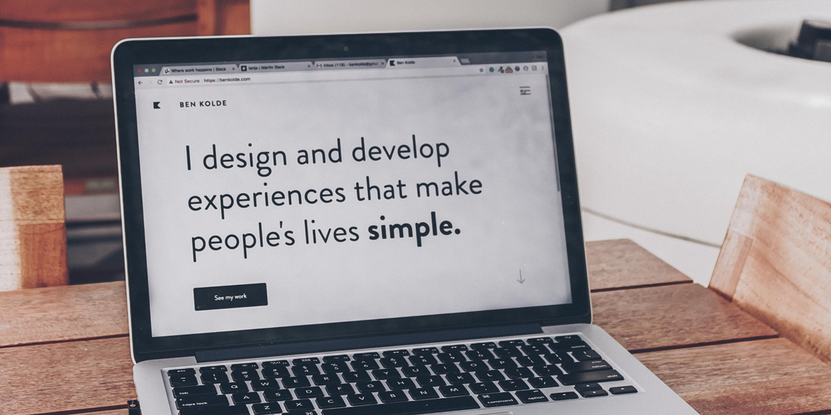
Using bold typography can help make certain parts of your product more noticeable, and this will let you funnel users to where you want them to be. Engaging headings with bold typography can give users a more simplified, informative, and valuable user experience.
If you want to keep up with the latest UI trends and make sure that your product remains competitive, then adding this to your product will help you give users a more excellent user experience.
Soft Shadows
This user interface design helps bring 2D elements to life and makes them look more like 3D elements. Why not just use 3D features? Using soft shadows can help you maintain a minimalistic design overall while giving off a 3D feeling to your product.
The use of soft shadows can help increase usability and make it easier for users to engage with the user interface. If you want to give your product an updated look without changing your 2D elements and replacing them, using soft shadows is what you should be doing. Product designing companies use techniques like this to give users a new experience without changing up the product too much.
Animations
Using animations in your user interface is more than just adding moving elements to the product. If spirits are used correctly, they help guide users to the essential features of the product to make the user’s experience more enjoyable.
There are so many ways that animations can be used creatively in your product. You could use animations on buttons to make them more dynamic, adding rotations to some elements, use transitions to change screens, and more.
Using animations can help make your product more usable, but it can also have the opposite effect if the spirits are not used correctly. If you are not sure how to correctly add animations to your product, you should hire an interaction design firm to help you. Doing this will improve the user experience and increase your product's chances of beating the competition.
When using animations you need to consider these things, do not let the animations reduce accessibility to the product for users, do not let the animations increase the wait time for users to use the product or access different features within the product, and do not let the animations increase loading times.
Minimalism
This UI design trend was to be expected. You have likely seen this mentioned in many different places and articles about UI design trends. Minimalism is a powerful design trend that has been popular for a long time, and it shows no sign of slowing down or becoming less popular.
Users expect to use products that give them a great user experience; users expect minimalism. Nobody wants to use a product that is cluttered and makes it difficult for the user to use its main features. Users want to quickly access the primary and essential features; they do not want to deal with clutter.
The top UI design agencies use this user interface design trend because it gives users the best experience. With this UI trend, you can have a clear and simple design that helps focus the user’s attention on the product’s essential features.
Glass Morphism
This UI design trend creates the illusion of glass and many designers have used it to give their products a futuristic look. If you want to create a product that gives off a futuristic feeling, then you need to use glass morphism in your user interface’s design.
This trend has become popular in 2021 and has given designers another way to express their ideas creatively so that users can experience when using their products. Not every product should use this trend as it won’t fit the brand's overall design, but if it complements the existing structure, you should try it.
Conclusion
These UI design trends should give you some inspiration about how you can update your product’s look and give users a different and more up-to-date experience that they will be expecting from you. UI design trends will continue to change, and you need always to know what others are doing and what directions you should be following. After reading this article, you know about some of the popular UI design trends in 2021 that designers use and add to their products.
 Members Area


