Have you ever heard something about Bounce Rate? This is such an unpleasant indicator that shows how much visitors leave your website right from the first visit. It depends on many things and this article will tell you how to reduce its value.
Create Effective & Truthful Titles
The core thing in writing a blog article or composing a page for your coorporate website is the content must match the title. If this condition is not fulfiled - all the rest written below is useless.
Your visitors must find the infomation they were going to read. And if your title doesn't reflect the things you are writing about, people will leave your page within the first seconds.
Imagine that you bought an account for your business from https://accfarm.com/. If you don't change its name, information and make it presentable, it's unlikely that anyone will pay attention to this account. The same goes for the title.
If your content matches headings than the only thing you need to do is to make your content look more readable.
Think Of a Larger Font Size
Whether reader find the needed infomation or not is directly related with this clause. As all of us most of our potential clients are enough lazy to read the whole page, expecially if it is written in a small font size. Also it is very important to choose a good looking font.
Exactly good looking, not extraordinary new popular font or something like that but quite clean and the most readable one. The best way is to choose some sans-serif font. I'm ready to show you an example of how the font may look different and influence our perception:
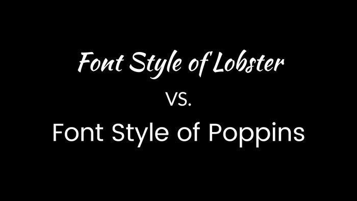
Lobster may be a nice font for some wedding agency, but never try to use such sophisticated font as a default font font your website. It will be a hard work for your readers to surf your page.
Cut Number of Fonts
Pay attention to the fonts you use. They all are the part of the design and will it be user-friendly or not depends only on this choice.
If you use a definite font for headings everywhere on your website this will be an subconscious hint for visitors that all entries written with this font are headings. And search of the information they are looking for will be working in the right direction.
It, actually, concerns all the design elements either buttons or links which should look similar on all pages.
Divide The Information Into Visual Breaks
There are many ways to divide content and make it easier to read, analyse and as the result - faster to understand.
The most popular among them are:
- headings
- sub headings
- lists bullet and numbered
- illustrations
It is much easier to navigate the infomation if it is structured.
Open Links In a New Tab
To keep visitor on a page longer you don't have to close the page until he does this on his own. Besides, it often happens that your reader click the link to know more about some things but wants to return back afterwards. Do not deprive him of the opportunity.
Keep your visitors on the pages as long as you need using
these easy hacks for your website and good luck!
 Members Area
