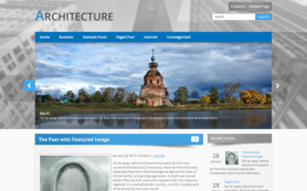
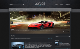
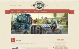
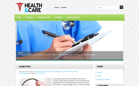
The appearance of a blog or website will either make it attractive or send away visitors immediately the land on the page. An expert should design a unique site that is interesting to visit and entices visitors to spend more time there. You can also check out more info on how to write thesis outline if you are planning to make a college-related site.
A good design is important to raise the profile of your brand and inspire confidence in visitors. The design also helps to engage visitors so that they can spend more time and visit other pages on your website. The best design is one that makes your website appear unique and interesting to use for visitors. Here are design tips that will transform the appearance and usability of your website.
1. Left Align Your Important Information
The website should be naturally aligned to the left. This is the normal style of reading and will, therefore, be natural for visitors. People begin reading or searching for information from the left side. Aligning your text and crucial information on the left will, therefore, make it easier for visitors to consume.
The website or blog should be segmented into columns for easier use. The top may feature highlights while the right captures adverts and links to other pages within your website. The notion is that visitors will be clicking on the other pages after reading the main article or content at the center.
2. Use Unique And Visible Color For Your Links
Links are crucial in SEO and boosting your web ranking. They must be made visible so that visitors are enticed to click onto them. Use a color that is different from what you have used on other pages, but the font must remain consistent.
The use of a consistent font type and size makes the hyperlinks part of the blog or your web content. However, a different color will highlight the links so that readers are enticed to click. They must appear natural yet standout on the page.
3. Reduce Clutter And Increase White Space
A cluttered website leaves the eyes of the reader tired. Information is also difficult to find on a cluttered website. Tips from web design experts point at the need to provide a simple-looking web page for visitors. The titles, images, and links will highlight other content on your website so that visitors can click.
White space does not necessarily mean the color. Your theme for the website could be blue or other shades that complement your brand. The secret is to avoid filling all the space with text and images such that a reader lacks an area to rest his or her eyes.
4. Provide A Site Map On Home Page
A site map makes it easy to get to any other page from any position. However, it is crucial when placed on the landing page. The site map reduces the time taken to get to find information on the website. If a visitor wastes time is looking for information on your website, the chances of returning will reduce.
5. Make The Blog Responsive
The beauty and usability of a website should be guaranteed on all platforms. A website, images, or text that lose shape across different platforms will discourage visitors from returning. Work with the designer to get a template that is responsive and will maintain an excellent appearance on different platforms.
A unique and attractive blog is an asset to your brand and business. Investing in a captivating website pays through increased traffic and better engagement with visitors. The competitiveness of a website will begin from design, meaning that if you get the design right, all other elements will be right.
 Members Area


