Looking at the web design trends for the upcoming year, it's easy to conclude that innovation is at the forefront of what users expect to see in 2021.
While classic solutions like minimalist layouts still reign supreme, brands that want to stand out will have to find ways to differentiate themselves from the competition. But here is the great news: this can be done with some simple alterations.
Animations are one of the best ways to update your website. They have a wide range of applications and can serve several purposes across the board. For one, they're absolutely fantastic at grabbing attention. But on top of that, they can help you better represent your products and services, giving potential customers valuable insights into your offer.
Are you ready to do something different in 2021 without having to change your entire website? If the answer is yes, the following are the top tips for featuring animations on your website.
UX Features
One of the most important things to understand about website animations is that they don't have to be extravagant to add to the user experience. In fact, subtlety and usability tend to be far superior to aesthetic effect.
With this in mind, it becomes clear that the best place to use animations will be in your user interface. Adding animation to navigation menus (see the example from Lululemon below) or as a response to users hovering over a section can have a positive outcome. They give visual cues, signaling to potential buyers that they can follow a link or even complete entire actions with a single click.
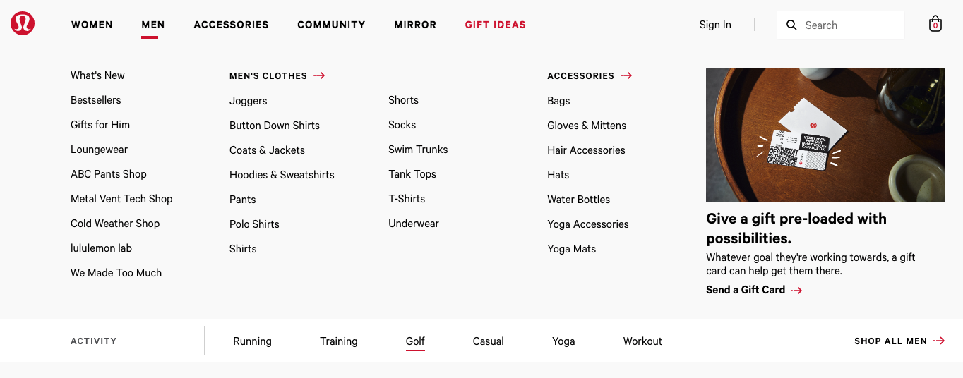
Source: lululemon.com
As you can see from the example below, Magic Spoon chose to add small animated details to their design and UI. Thanks to this decision, they created a more complete website experience that doesn't overwhelm yet still looks great.

Source: magicspoon.com
Hero Section Visuals
In addition to practical applications, animations can also be a great way to add visual appeal to your pages.
The reason why animated websites tend to perform better than those which are static lies in the way our brains are wired. Apparently, humans are naturally predisposed to pay closer attention to moving objects as a result of the fight or flight response. So, web designers can use this natural reaction to direct visitors towards the most valuable elements on a website.
For example, adding sliders to the hero section is standard practice. As images and messaging dynamically shift, users are presented with different value propositions they may find interesting.
However, brands can also choose to have one single animated element above the fold and use it to ensure a higher clickthrough rate on centrally-placed CTA buttons. Adding a moving header image, such as in the example below, will inevitably ensure that users pause in the right section of your website. In the end, this increases the likelihood of their visit ending in a conversion.

Source: goaura.com
Product Visualisation
What happens when you're selling products and services that are difficult to describe with words or static images? Well, you could go the route of adding videos to your website. However, those can consume a lot of storage, which might negatively impact the user experience. Alternatively, you could opt to use animations.
Whether you choose the standard 360-degree view that many ecommerce websites include or decide to go with something a bit more complicated is entirely up to you. But, do keep in mind that adding animations to your product pages can help you create a more immersive experience for your users.
Take a look at this example by TAG Heuer. You'll see that their Connected collection of smartwatches is presented through an interactive design. It allows the user to get better acquainted with the product without having to do anything else than scroll.
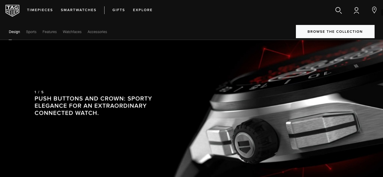
Source: tagheuer.com
What this achieves is that it moves potential buyers through the sales funnel more effectively and without risking the occurrence of a bounce.
Storytelling
Finally, don't forget about the impact web design has on your branding. In truth, there's no better way of defining and promoting your company than by creating strong associations between what you do and the values you uphold. And although words and visuals can achieve that effect, the process is a lengthy one that requires cross-platform marketing strategies and a great deal of dedication.Animations, however, can help you make a more lasting impression without the lengthy process.
Take a look at Samuel Day's website. You'll see that the graphic designer created a unique way to represent his work and aesthetics. The design combines a standard portfolio with a storytelling element triggered by scrolling actions. Consequently, it allows potential clients to get a complete insight into what they can expect to receive if they hire the person.
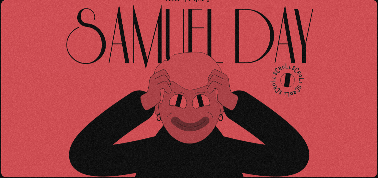
Source: samuelday.de
Now, although this is a stellar example of web animations, it's also one that's quite difficult to recreate for most people. However, companies that want to leave this type of impression can borrow ideas or elements from the concept, ensuring that they stand out from the competition 100%.
Final Thoughts
There are many different ways to include animations on your website. The sheer beauty of the feature is that it can be applied to a variety of purposes and with differing degrees of intricacy. This means that web designers and brands can work together to find the right balance between aesthetics and functionality. Moreover, they can use animated components to drive conversions, strengthen branding, enhance the user experience, or even direct web visitors' purchase paths.
Nevertheless, when choosing elements to animate, it's crucial to always prioritize experience and ease of use. Otherwise, an appealing aesthetic detail may become a hindering distraction.
 Members Area
